

Posters in 2020 - KING TONY Tools
Below are the posters I created when I joined KING TONY tools in 2020. While these may not represent all my work from that year, they showcase my design capabilities at the time, and I am relatively satisfied with them.
I have long been fascinated by the CyberPunk aesthetic, not just in comics or movies but also due to my deep immersion in it after the release of CyberPunk 2077. Therefore, I incorporated numerous elements such as pixels, noise, bits, grids, and user interfaces in designing the following posters.
Although there is room for improvement in many aspects of these creations, they remain crucial foundational pieces for me.
以下是我在2020年進入KING TONY任職時所創作的海報,雖然這些不是2020年全部的作品,但以我當年的設計能力來說算是相對滿意的作品。 我從以前就非常著迷CyberPunk相關的世界觀與視覺概念,不僅是漫畫或電影,更因為CyberPunk2077的發售之後而深陷於其中。 因此我使用了大量像素、雜訊、位元、網格以及使用者介面等概念來設計下列海報,雖然不難發現以下創作有許多可以改善的地方,但仍然是我非常重要的起步之作。

I tried jazzing up this product with a cool retro noise vibe. Picture an endless grid space for the backdrop, with the foreground rocking a rad interface straight out of an old-school video game.
我嘗試使用復古雜訊風格來呈現此產品,背景為無盡的網格空間,前景則模擬了復古遊戲的選項介面。

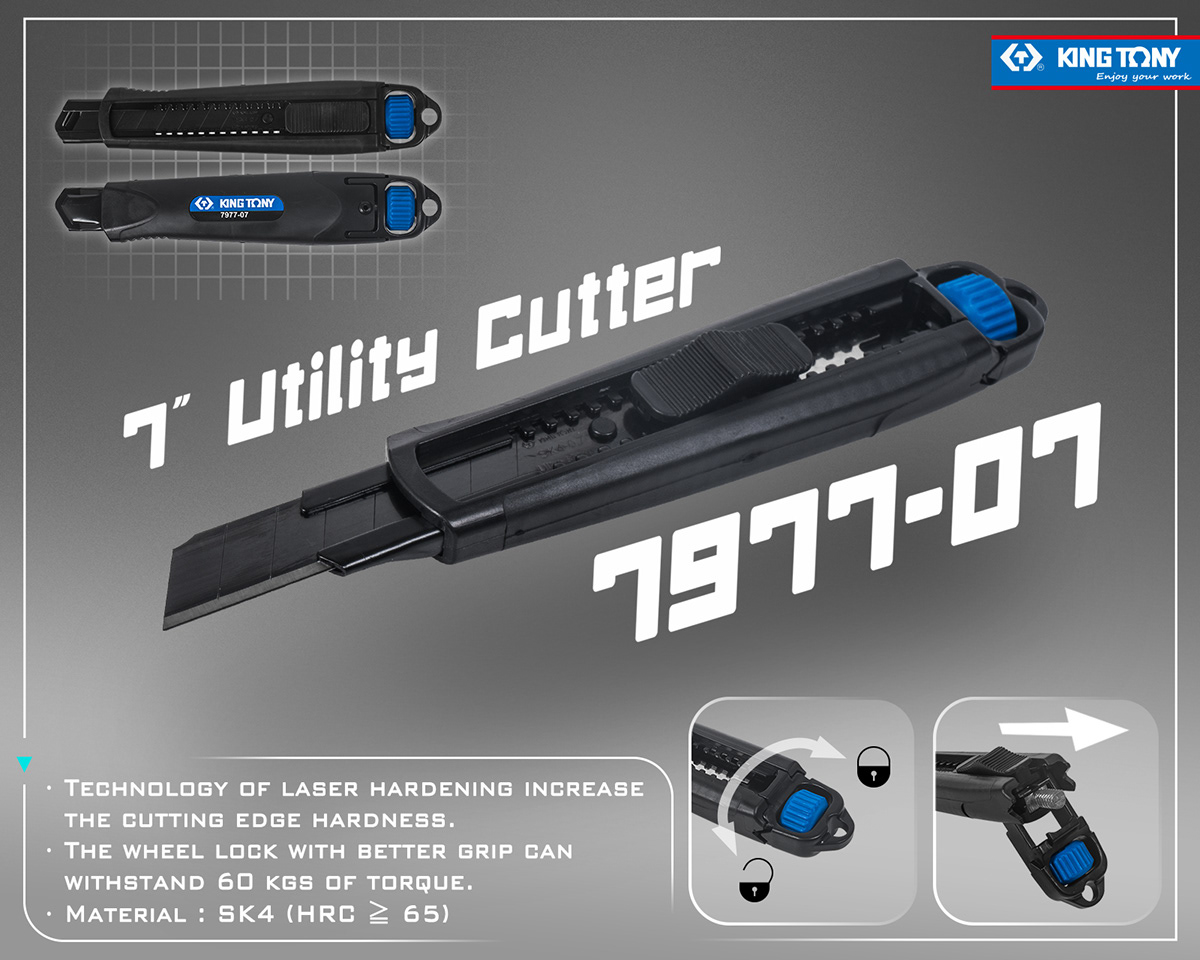
The look of this product gave me Gundam vibes, so I went for a sleek and simple geometric tech interface to match its edgy 3D feel. For the background, I took inspiration from the common hexagons you see in industry, keeping that 'endless grid' concept flowing.
此產品的外型令我想到鋼彈的造型,因此我採用扁平且簡約的幾何科技介面來搭配它本身有稜有角的立體感,而背景的構想則以工業常見的六角形來延續「無盡網格」的概念。
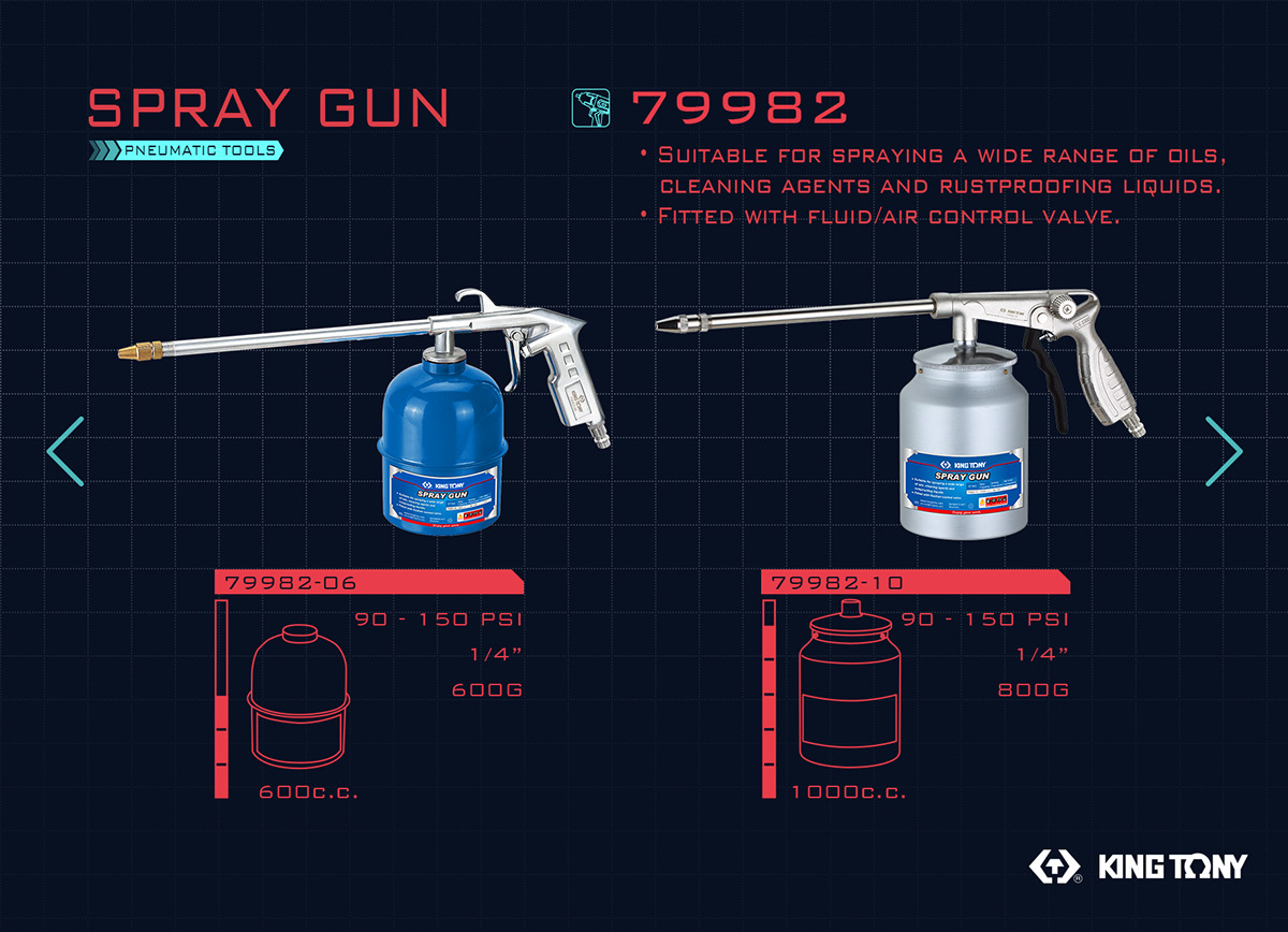
To showcase two similar products at once, I took cues from the game interface and color scheme of Cyberpunk 2077. I treated the products like weapons in the game, presenting their respective info and features with a cool, data-driven interface.
為了同時介紹兩款相似的產品,我參考了cyberpunk2077裡的遊戲介面及配色,將產品視為遊戲中的武器,並將各自的資訊及特色以數據化的介面來呈現。
This time around, I tried going big with the product, having it take center stage along with its name and number all floating in the mix. The grid elements, usually a staple, are now used to complement the product's flat perspective in this poster.
這次我嘗試將產品的主體放得更大,並使產品與其名稱、號碼同時漂浮於畫面之中,而先前常用的網格元素在此海報則用來襯托產品的平面視角。


